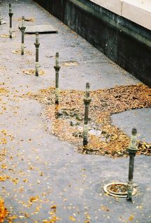
I learned this cool trick of adjusting color balances in Photoshop, and found that I can shift away from cyan towards red. This is my favorite shot off the roll, despite Program mode opening the aperture too much and throwing the foreground out of focus. I was hoping to capture the pleasing feel of autumn, and I think this one does in spades.


4 Comments:
This is a great photo. I've been really enjoying all your pictures and am very jealous of your great eye. I am a really crappy photographer, although I always think the next shot will be great but it never is. So I look at yours instead, or my kid's.
Well, there is a simple tip that really helped me out. It's the classic rule that you should imagine a tic-tac-toe board in your viewfinder. Place the subject or focus not in the center of the frame, but where the imaginary grid lines would intersect.
Stick to that rule, and immediately you'll see a huge improvement in your photos. Look back at my photos, and you'll see that I apply that rule religiously.
This one's good, Andy, I like it. I'd darken it and increase the contrast, though, to punch it up. It's a potentially very rich photo. Nice composition. :)
Thanks Andy. I really appreciate your advice. You are very generous with your time. Best!
Post a Comment
<< Home