Thursday, June 09, 2005
Previous Posts
- View of the festival from the Adams St. Bridge. I...
- A tall skinny updraft captured from my apartment p...
- The rays are more defined in this one. Too bad th...
- This is the fountain on the traffic circle where T...
- The fountain catches the sunlight better in this one.
- Ever the eternal skeptic, I only take astrology wi...
- Could you guys help me out?
- Update
- This morning Dr. Phil was on tv in the break room....
- Dude... I just found my stuff used on another webs...
Bookmarks:
- Texas Gurl (The first blog I picked up reading, and I'm still hooked!)
- Callahan Photography (Why is this girl not world famous?)
- Nanabear
- The Last Ditch (My Hero. My Role Model. Whom I hope to become some day. Perpetuating my love of Canadians)
- Michelle (Unfortunately not Canadian, but from Seattle, and that's close enough to count as cool in my book)
- Shutterbug!
- Diva Cow Girl (refreshingly frank and honest)
- The Sweet Life Photography (Heidi, a hometown photography enthusiast)
- Boinkology.com (Actual intellectual (and often humorous) discourse on intercourse)


This work is licensed under a Creative Commons License.


3 Comments:
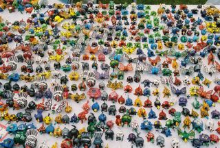
I love this shot, lots of little wibbly things, good colour test as well - to think some people use colour test charts... ;)
I had framed it in my viewfinder so that you couldn't see the edge of the table. I hoped for an abstract sea of wibbly things instead of a table-top. To try to crop it out in Photoshop just didn't seem honest.
Well you nearly got it, you could just white out the grassy area at the back... ;)
Post a Comment
<< Home